Case Study
Website Redesign &
Web Shop Launch
For Soluman Consultancy
My Role
This project explores a refreshed website concept for Soluman Consultancy, a leadership and career development practice focused on inclusive, early-career and first-level leadership growth.
The goal was to translate Soluman’s BOLD, solutions-driven philosophy into a modern digital experience that feels credible, approachable, and conversion-focused—supporting both individual coaching programmes and corporate leadership services.
1. Completely redesigning the core pages from the ground up
2. Implementing WooCommerce for digital product sales
3. Building sales and upsell email funnels

The Challenge
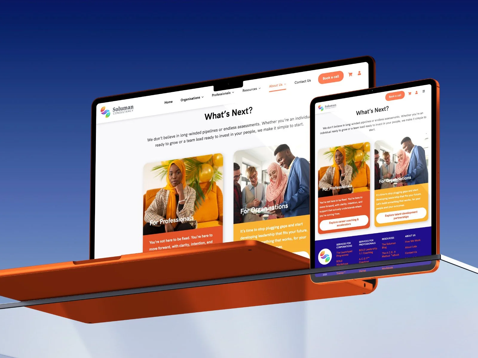
Text-heavy pages made it difficult to scan for value proposition
Navigation menu was cluttered and unclear with missing brand presence

Primary calls-to-action were missing above the fold

Missing structure made it difficult to distinguish between solutions for individuals versus organizations

Inconsistent use of brand colors weakened visual hierarchy

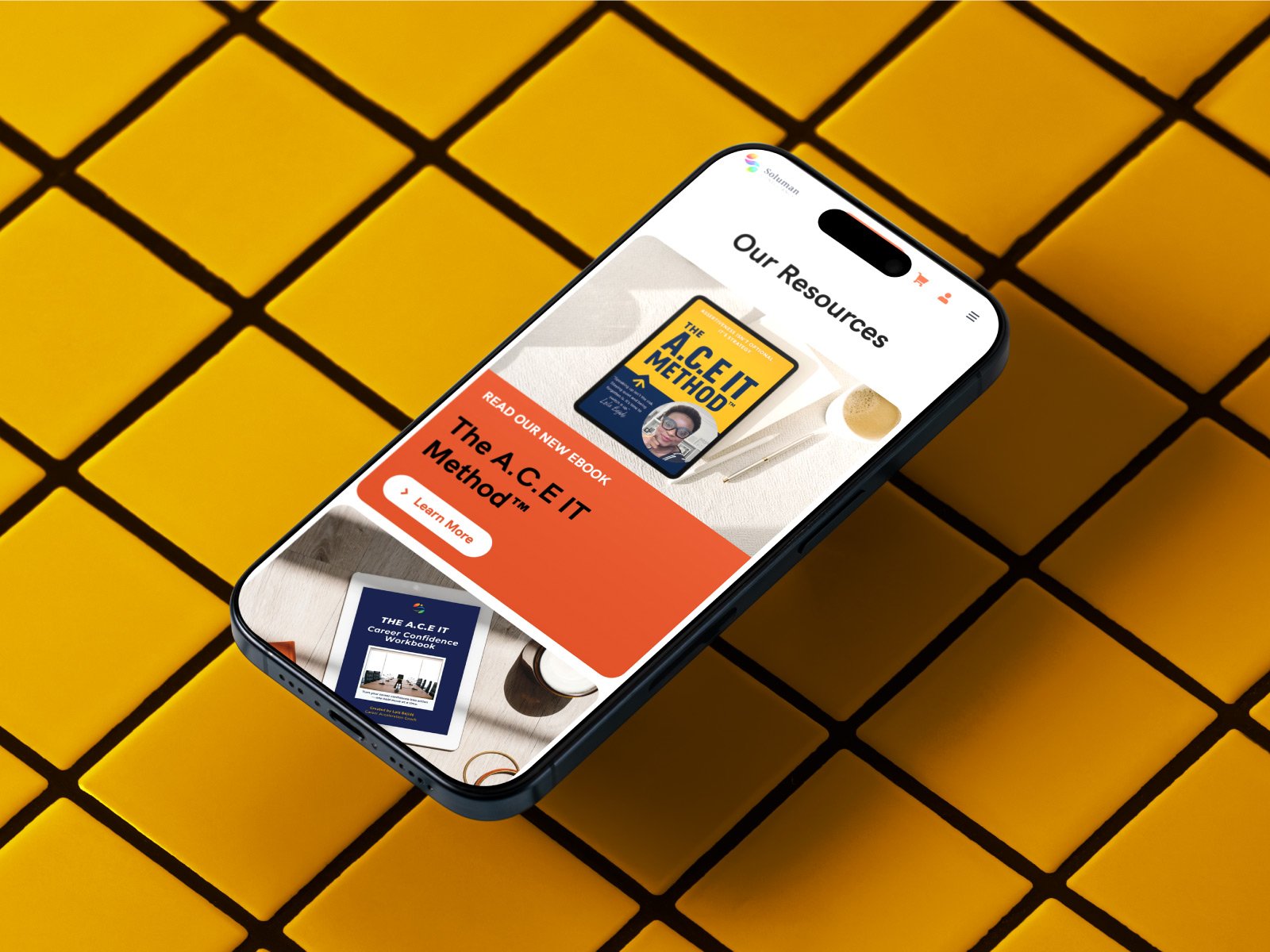
The client needed custom WooCommerce product pages to support the sale of digital products

The Process & Solution
1
Kick-Off
Identifying pain points and improvement opportunities
2
Prototyping
Defining content hierarchy, design system, wireframing
3
Building
Building pages in WordPress staging environment with Avada & WooCommerce
4
Funnels
Building email funnels triggered by product purchase (Mailerlite)
5
Testing & Launch
QA to make sure every functionality works, plus performance check
Added prominent calls-to-action in the main navigation and at the top of each service page to support conversion goals
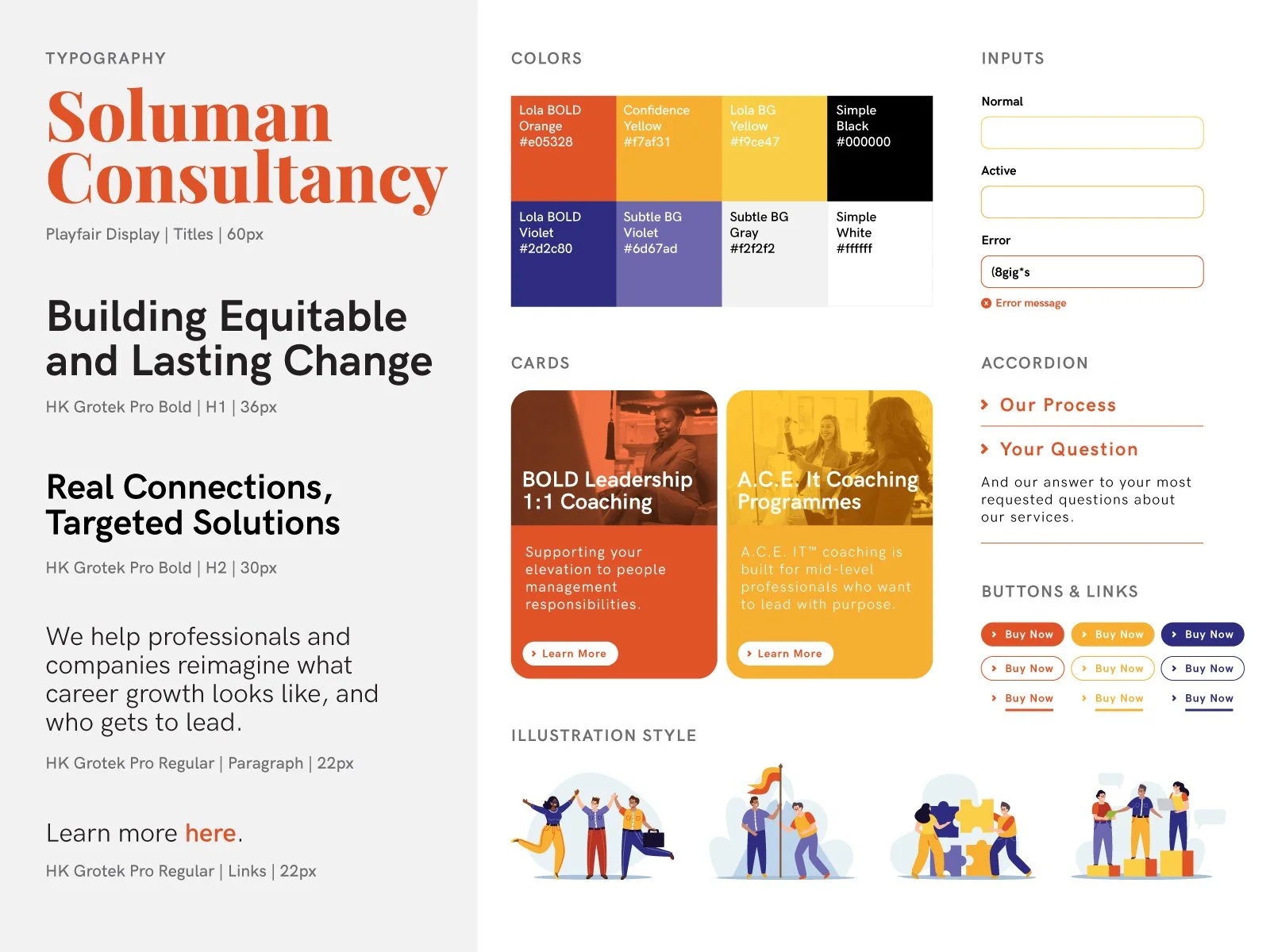
Applied brand colors strategically to create hierarchy, using the primary brand color for navigation, CTAs, and links
Designed a simplified top-level navigation that guides users toward relevant services with fewer, clearer choices
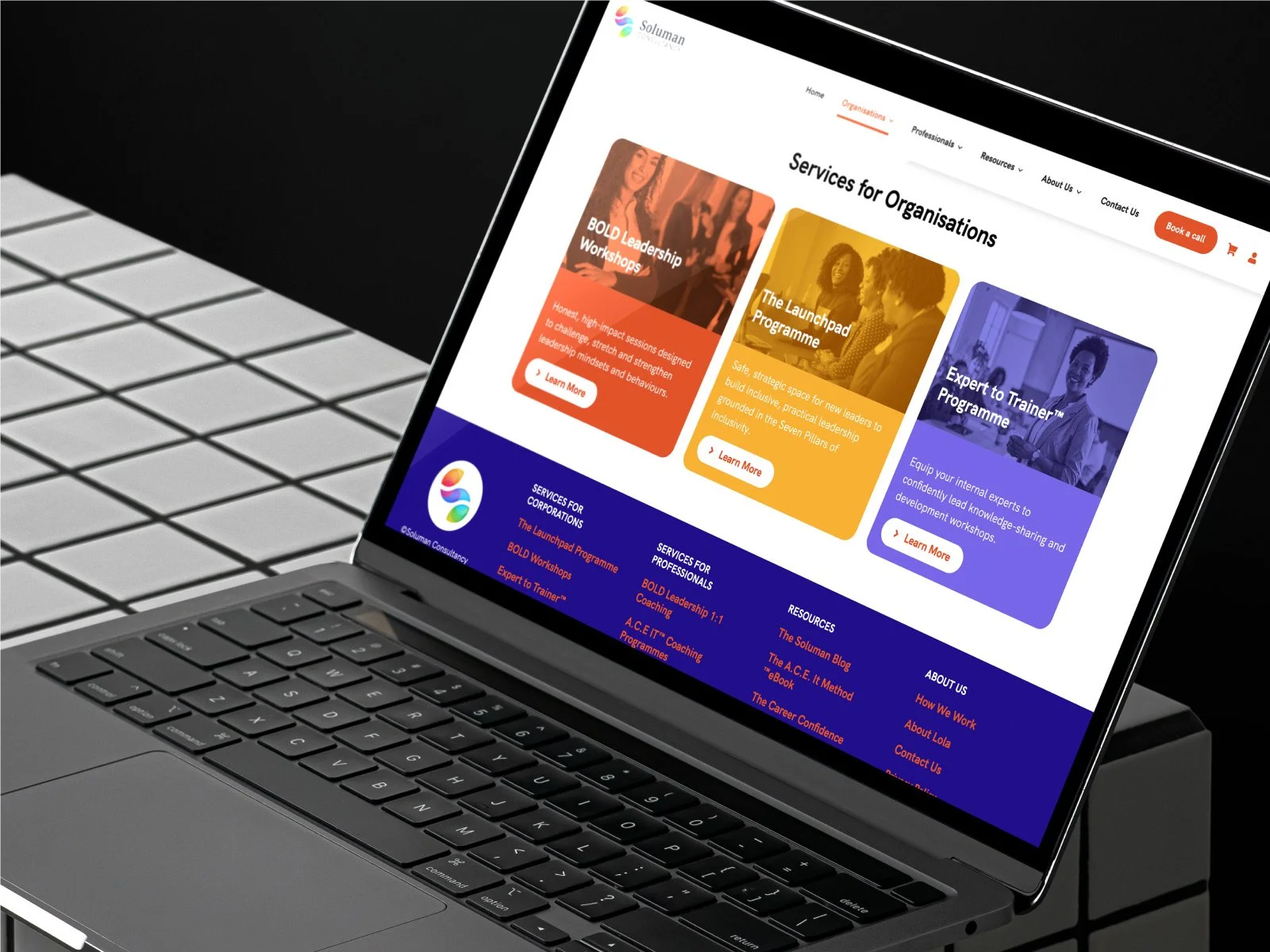
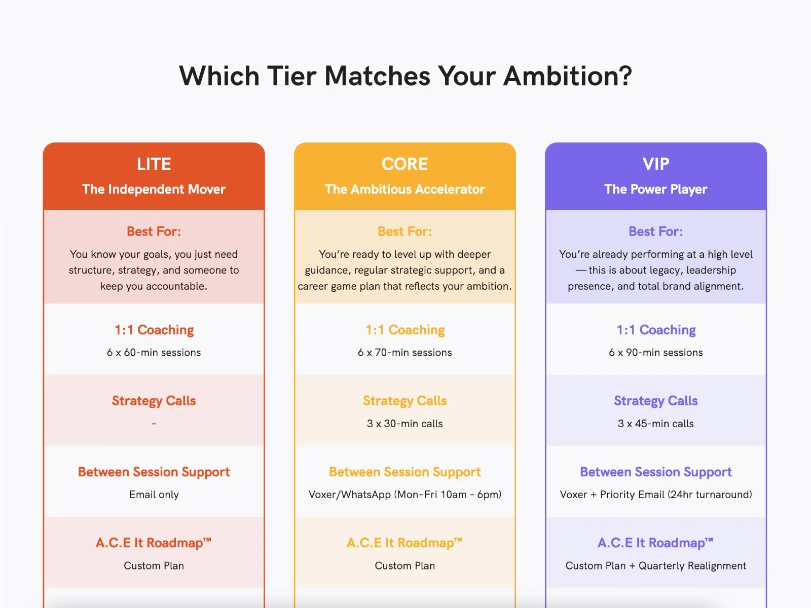
Created high-level service overview pages supported by dedicated sub-pages for detailed messaging, clearly separating individual and organizational offerings
I re-structured long-form content into clearly defined sections based on user intent
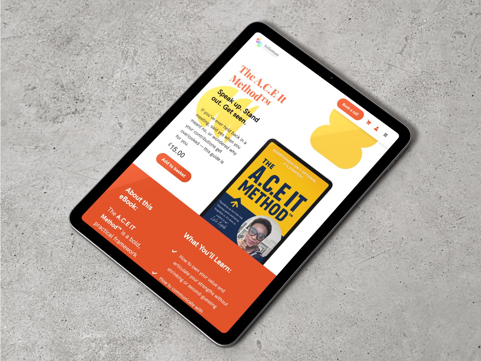
Designed custom WooCommerce product templates and dedicated landing pages for three core digital products, focusing on benefits, trust signals, and outcomes
The Impact
The redesigned website delivers a clearer, more intuitive user experience that makes Soluman’s services easier to navigate, understand, and act on, while preserving the brand’s bold visual identity and commitment to diversity.
Beyond improved usability, the new structure enabled Soluman to launch and scale digital product sales. The MailerLite integration supports automated follow-ups, product upsells, and nurture sequences, guiding users from free content toward paid resources such as the eBook, workbook, and live training.
“Andrea brings a really strong balance of creativity and commercial thinking. She’s not just focused on making things look good (although they do), she’s thinking about how people move through the site, what they need to see, and how the whole experience connects back to your brand.
And I’ll say this, she spotted things I hadn’t even considered and just handled them. No fuss, no over-explaining, just solutions. I didn’t even realise half of it needed fixing until she’d already improved it.
For me, that meant I could actually focus on running my business without constantly checking in or chasing updates, which, let’s be honest, is rare.
The end result? A website that feels far more aligned, far more “me”, and does a much better job of communicating the value of what I offer.
I’ll absolutely be working with Andrea again and would recommend her to anyone who is serious about their brand and wants it to show up properly online.”
Lọ́lá Béjidé MBA - Soluman Consultancy