Notion’s Brand Strategy: Designing a Visual System for Growth
Why some brands scale visually — and others just decorate
Every successful brand has a visual identity. But only a few have a visual system.
In this series, I’ll be dissecting brands that didn’t just “look good” at launch, but managed to scale clarity, personality, and usability across products, teams, and millions of users. We’ll look at what they designed, why they designed it that way, and how those decisions support growth, adoption, and long-term relevance.
This is not about trends or aesthetics in isolation.
It’s about strategy made visible.
First up: Notion.
Notion - Simplicity that Scales
Notion is one of those rare brands that feels both designed and unfinished—and that’s entirely intentional.
At first glance, its visual identity seems almost too simple: black and white, minimal typography, playful line illustrations, lots of whitespace. But behind that apparent simplicity sits a carefully engineered system that supports Notion’s core promise: flexibility without chaos.
Let’s break down how they do it.
A visual identity that mirrors the product philosophy
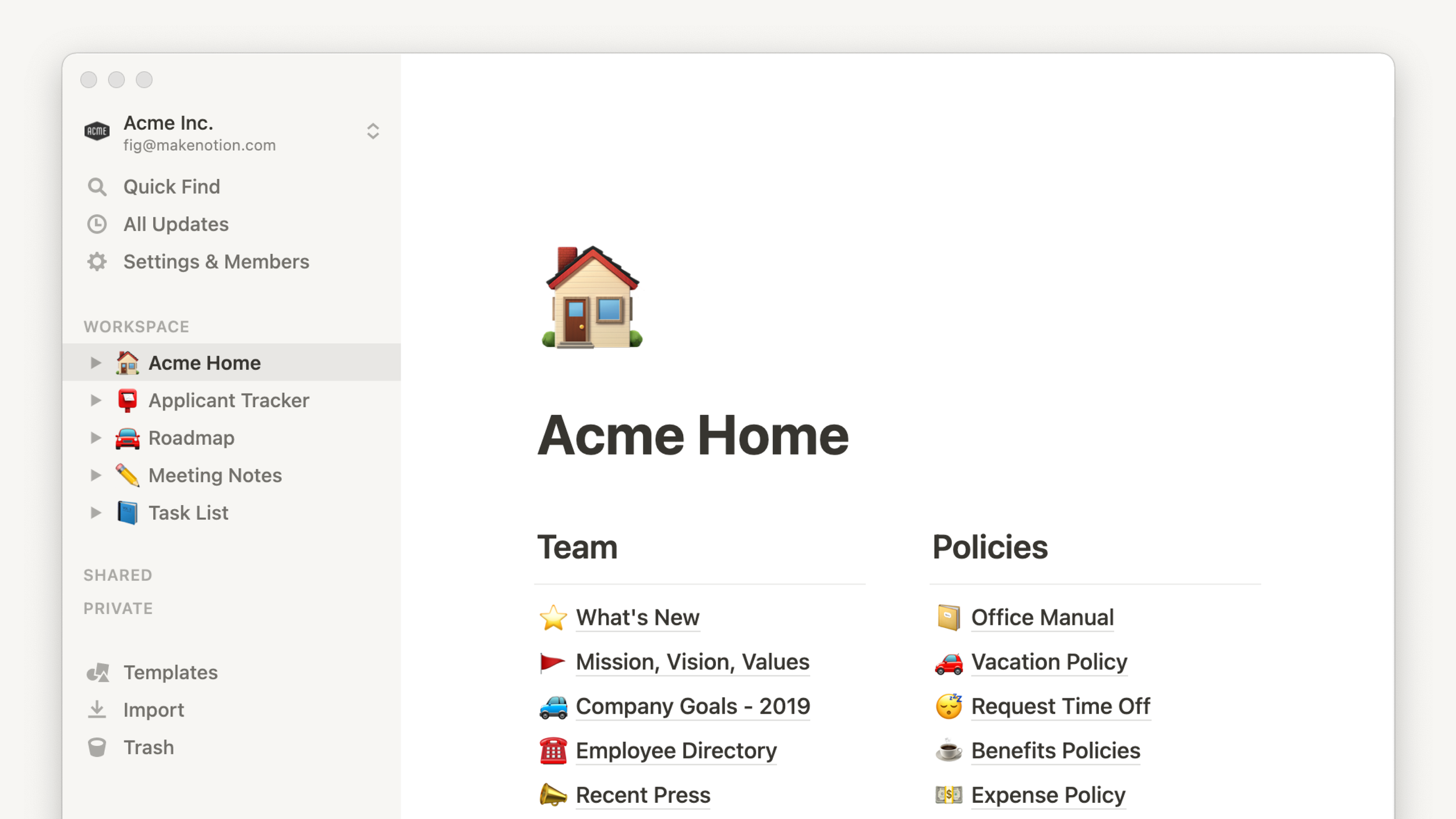
Notion’s product is modular. Pages are made of blocks. Everything can be rearranged, duplicated, repurposed. Their visual identity follows the same logic. Instead of a rigid brand system with strict compositions, Notion built:
A neutral base (black, white, grayscale)
A limited but expressive illustration style
UI patterns that feel almost invisible
This allows the content—user-generated content, templates, workflows—to take center stage.
Strategic takeaway:
Notion doesn’t try to “outshine” its users. The brand behaves like infrastructure, not decoration.
Differentiator
The visual system mirrors how the product behaves: modular, flexible, and user-controlled rather than brand-controlled.
Strategic question to ask:
If our visual identity behaved like our product or service, what would it allow users to change, rearrange, or ignore — and what would remain non-negotiable?
Why this matters:
This forces teams to stop designing around the product and start designing from its logic.
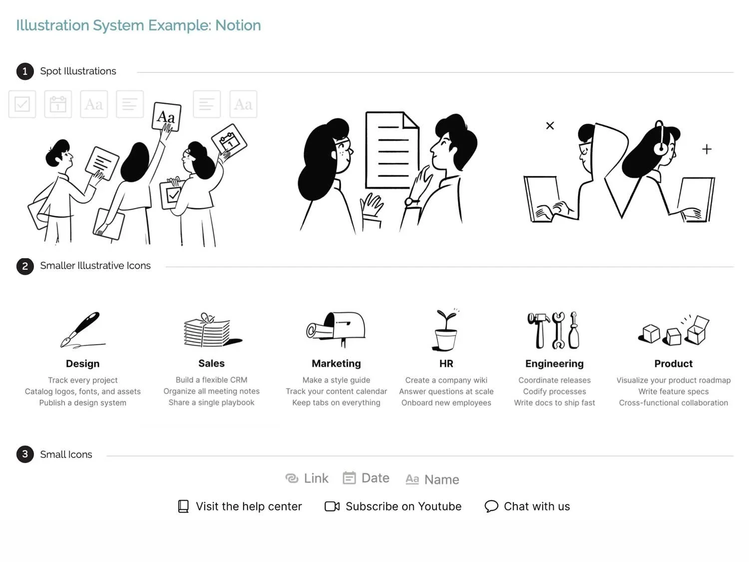
The illustration system: character without noise
Notion’s hand-drawn illustrations are one of its most recognizable assets. They’re:
Imperfect
Slightly quirky
Consistent in line weight and tone
Emotionally warm without being childish
Crucially, they’re also non-specific. The characters aren’t tied to gender, culture, or profession. This keeps them universally relatable and endlessly reusable.
These illustrations act as:
Emotional anchors in onboarding
Visual pauses in documentation-heavy environments
A soft counterbalance to an otherwise stark interface
Strategic takeaway:
Illustrations here are not branding fluff — they’re UX tools.
Differentiator
Illustrations are not there to “add personality,” but to reduce friction, soften complexity, and guide emotional pacing.
Strategic question to ask:
Where do users feel cognitive load, uncertainty, or fatigue — and how could visual elements actively reduce that instead of just filling space?
Why this matters:
It reframes illustration and visual expression as functional tools, not aesthetic add-ons.
Intentional restraint as a scaling strategy
As Notion scaled from a niche productivity tool to a mainstream platform used by startups, enterprises, students, and creatives, their identity didn’t become louder.
It became more restrained.
Why? Because restraint:
Ages better than trend-driven visuals
Survives rapid feature expansion
Allows internal teams to ship faster without constant design bottlenecks
Notion’s system is forgiving. It leaves room for inconsistency without breaking.
Strategic takeaway:
A good design system doesn’t enforce perfection — it absorbs imperfection.
Differentiator
The identity avoids loudness and trend-dependence, making it durable across rapid growth, feature expansion, and team turnover.
Strategic question to ask:
Which visual elements in our brand would break first if we doubled our product features, channels, or team size tomorrow?
Why this matters:
It exposes which parts of the system are fragile, overly precious, or too hard to maintain at scale.
Community as a brand extension
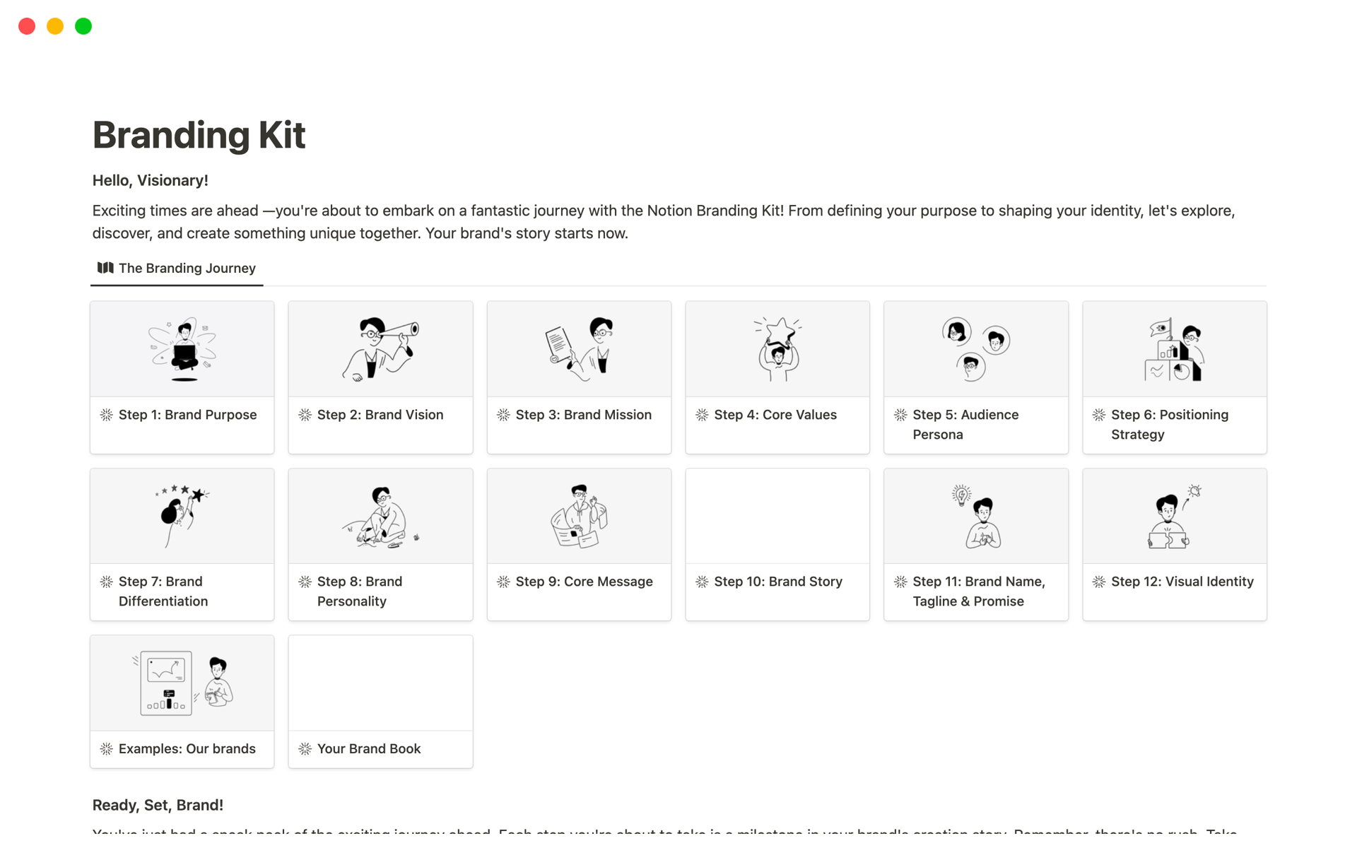
One of Notion’s smartest moves was allowing its users to become visual contributors:
Public templates
Shared dashboards
Screenshots circulating on social media
Creator-led tutorials and ecosystems
Because the core brand is visually neutral, user-generated content still looks like Notion—even when Notion didn’t design it.
That’s not an accident. That’s system design.
Strategic takeaway:
If your identity is flexible enough, your users will scale it for you.
Differentiator
Users are empowered to create content that still “looks on-brand” without strict enforcement.
Strategic question to ask:
If users reused, modified, or screenshot our product today, would the result still be recognizably ours — and why?
Why this matters:
It tests whether the brand identity is structural (system-based) or surface-level (style-dependent).
Notion’s visual identity works not because it is minimal, trendy, or “nice,” but because it is structurally aligned with how the product behaves. Every design decision—from the restrained color palette to the modular layouts and imperfect illustrations—supports flexibility, scalability, and user ownership.
Rather than enforcing rigid brand expressions, Notion built a system that can stretch, absorb inconsistencies, and evolve alongside its users. The result is a brand that feels calm, human, and trustworthy even as it grows more complex. This is not accidental minimalism; it’s strategic restraint.
Building or scaling a brand system?
If your visual identity is starting to crack under growth, I help teams design systems that stay clear, flexible, and scalable. Let’s talk.